Python Based Visualizations (Deprecated)
Deprecated
Python based visualization is deprecated. We recommend fetching data via Kubeflow Pipelines SDK and visualizing from your own notebook instead.This page describes Python based visualizations, how to create them, and how to use them to visualize results within the Kubeflow Pipelines UI. Python based visualizations are available in Kubeflow Pipelines version 0.1.29 and later, and in Kubeflow version 0.7.0 and later.
While Python based visualizations are intended to be the main method of visualizing data within the Kubeflow Pipelines UI, they do not replace the previous method of visualizing data within the Kubeflow Pipelines UI. When considering which method of visualization to use within your pipeline, check the limitations of Python based visualizations in the section below and compare them with the requirements of your visualizations.
Introduction
Python based visualizations are a new method to visualize results within the Kubeflow Pipelines UI. This new method of visualizing results is done through the usage of nbconvert. Alongside the usage of nbconvert, results of a pipeline can now be visualized without a component being included within the pipeline itself because the process of visualizing results is now decoupled from a pipeline.
Python based visualizations provide two categories of visualizations. The first being predefined visualizations. These visualizations are provided by default in Kubeflow Pipelines and serve as a way for you and your customers to easily and quickly generate powerful visualizations. The second category is custom visualizations. Custom visualizations allow for you and your customers to provided Python visualization code to be used to generate visualizations. These visualizations allow for rapid development, experimentation, and customization when visualizing results.

Using predefined visualizations
Predefined matrix visualization

- Open the details of a run.
- Select a component.
- The component that is selected does not matter. But, if you want to visualize the output of a specific component, it is easier to do that within that component.
- Select the Artifacts tab.
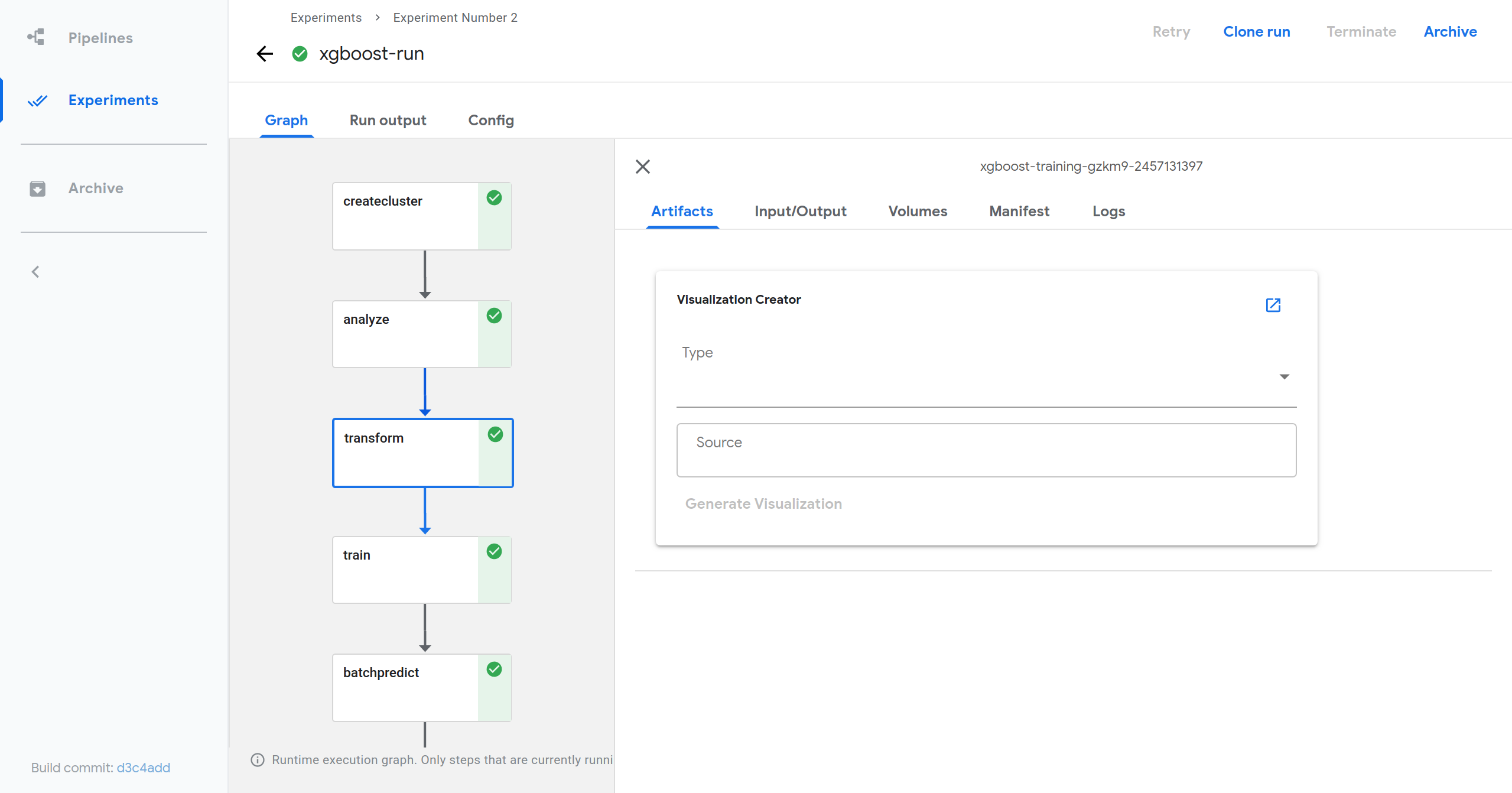
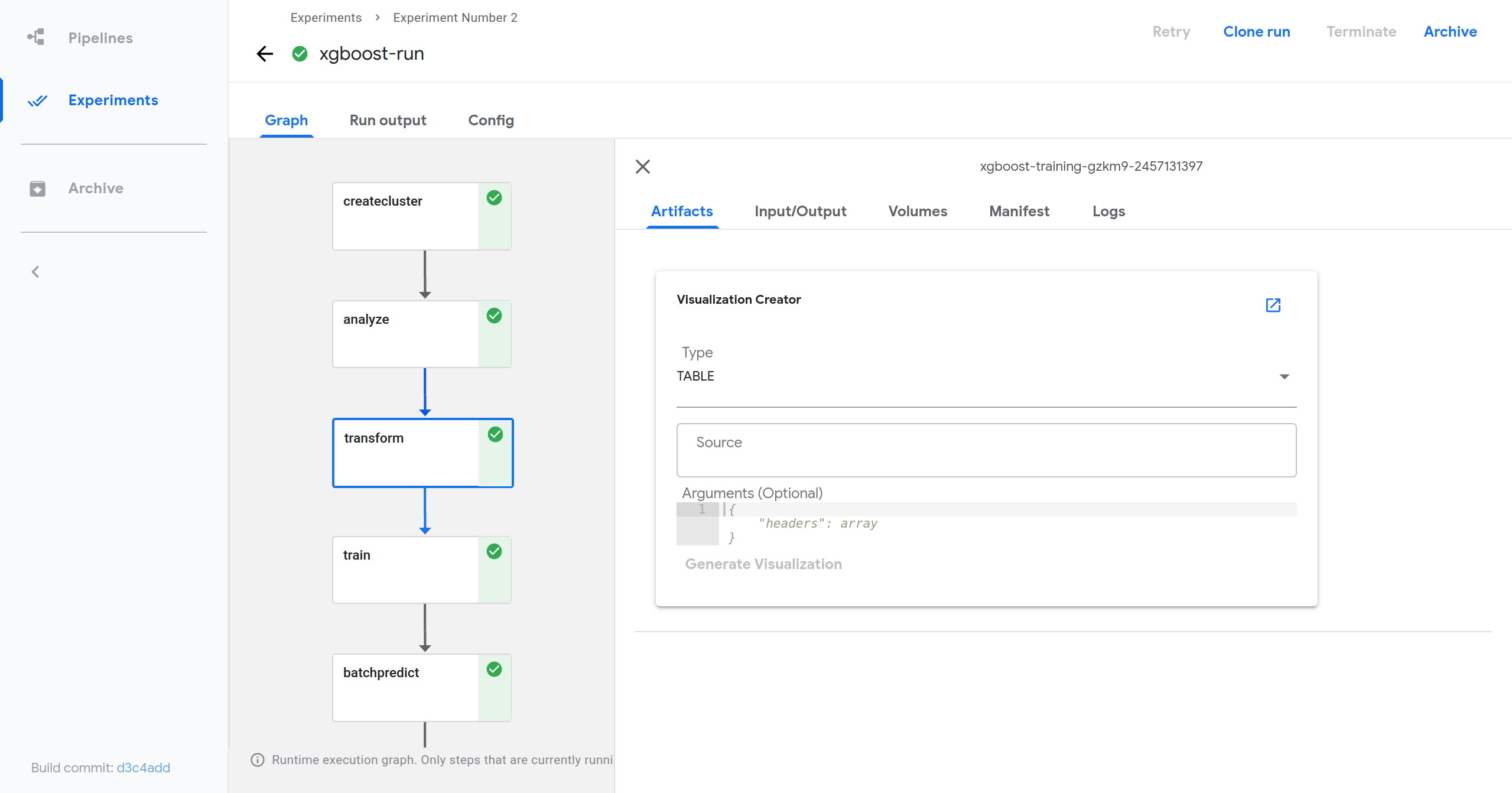
- At the top of the tab you should see a card named Visualization Creator.
- Within the card, provide a visualization type, a source, and any necessary
arguments.
- Any required or optional arguments will be shown as a placeholder.
- Click Generate Visualization.
- View generated visualization by scrolling down.
Predefined TFX visualization
- On the Pipelines page, click [Sample] Unified DSL - Taxi Tip Prediction Model Trainer to open the Pipeline Details page.
- On the Pipeline Details page, click Create run.
- On the Create run page,
- Use a run name and an experiment name of your choice.
- In the pipeline-root field, specify a storage bucket that you have permission to write to. For example, enter the path to a Google Cloud Storage bucket or an Amazon S3 bucket.
- Click Start to create the run.
- After the run is complete, on the Run Details page, click any step. For example, click the first step csvexamplegen as shown in the video above.
- In the side panel of the selected step,
- Click the Artifacts tab.
- In the Visualization Creator section, choose TFDV from the drop down menu.
- In the Source field, use gs://ml-pipeline-playground/tfx_taxi_simple/data/data.csv, which is the input data used for this run.
- Click Generate Visualization and wait.
- Move to the bottom of the Artifacts tab to find the generated visualization.
Using custom visualizations

- Enable custom visualizations within Kubeflow Pipelines.
If you have not yet deployed Kubeflow Pipelines to your cluster, you can edit the frontend deployment YAML file to include the following YAML that specifies that custom visualizations are allowed via environment variables.
- env:
  - name: ALLOW_CUSTOM_VISUALIZATIONS
    value: true
If you already have Kubeflow Pipelines deployed within a cluster, you can edit the frontend deployment YAML to specify that custom visualizations are allowed in the same way described above. Details about updating deployments can be found in the Kubernetes documentation about updating a deployment.
- Open the details of a run.
- Select a component.
- The component that is selected does not matter. But, if you want to visualize the output of a specific component, it is easier to do that within that component.
- Select the Artifacts tab.
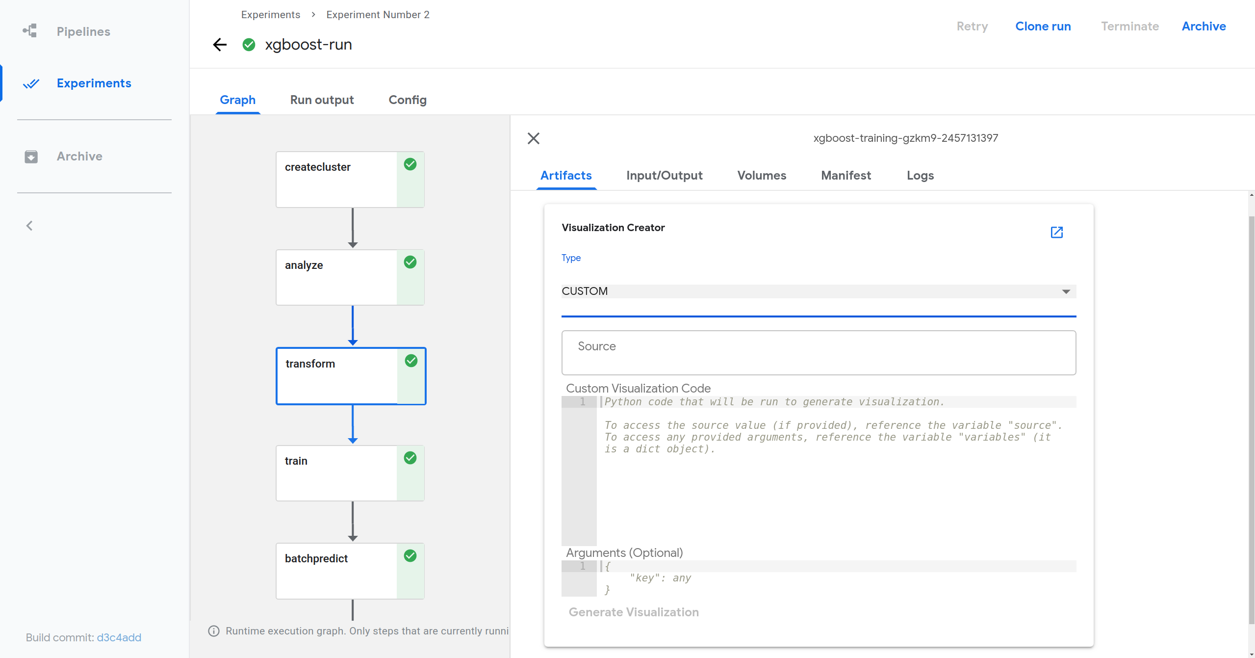
- At the top of the tab you should see a card named Visualization Creator.
- Within the card, select the CUSTOM visualization type then provide a source, and any necessary arguments (the source and argument variables are optional for custom visualizations).
- Provide the custom visualization code.
- Click Generate Visualization.
- View generated visualization by scrolling down.
A demo of the above instructions is as follows.
- On the Pipelines page, click [Sample] Unified DSL - Taxi Tip Prediction Model Trainer to open the Pipeline Details page.
- On the Pipeline Details page, click Create run.
- On the Create run page,
- Use a run name and an experiment name of your choice or simply use the default names chosen for you.
- In the pipeline-root field, specify a storage bucket that you have permission to write to. For example, enter the path to a Google Cloud Storage bucket or an Amazon S3 bucket.
- Click Start to create the run.
- After the run is complete, on the Run Details page, click the step of statisticsgen. This step’s output is statistics data generated by Tensorflow Data Validation.
- In the side panel of the selected step,
- Click the Input/Output tab to find out the mlpipeline-ui-metadata item and click the minio link there. This will open a new browser tab with information on output file path. Copy the output file path as shown in the demo video.
- Get back to the Run Details page, and click the Artifacts tab.
- At the top of the tab you should see a card named Visualization Creator, choose Custom from the drop down menu.
- In the Custom Visualization Code field, fill in the following code snippet and replace [output file path] with the output file path you just copied from mlpipeline-ui-metadata.
- Click Generate Visualization and wait.
- Move to the bottom of the Artifacts tab to find the generated visualization.
Known limitations
Multiple visualizations cannot be generated concurrently.
- This is because a single Python kernel is used to generate visualizations.
- If visualizations are a major part of your workflow, it is recommended to
increase the number of replicas within the
visualization deployment YAML
file or within the visualization service deployment itself.
- Please note that this does not directly solve the issue, instead it decreases the likelihood of experiencing delays when generating visualizations.
Visualizations that take longer than 30 seconds will fail to generate.
For visualizations where the 30 second timeout is reached, you can add the TimeoutValue header to the request made by the frontend, specifying a positive integer as ASCII string of at most 8 digits for the length of time required to generate a visualization as specified by the grpc documentation.
For visualizations that take longer than 100 seconds, you will have to specify a TimeoutValue within the request headers AND change the default kernel timeout of the visualization service. To change the default kernel timeout of the visualization service, set the KERNEL_TIMEOUT environment variable of the visualization service deployment to be the new timeout length in seconds within the visualization deployment YAML file or within the visualization service deployment itself.
- env:
  - name: KERNEL_TIMEOUT
    value: 100
The HTML content of the generated visualizations cannot be larger than 4MB.
gRPC by default imposes a limit of 4MB as the maximum size that can be sent and received by a server. To allow for visualizations that are larger than 4MB in size to be generated, you must manually set MaxCallRecvMsgSize for gRPC. This can be done by editing the provided options given to the gRPC server within main.go to
var maxCallRecvMsgSize = 4 * 1024 * 1024
if serviceName == "Visualization" {
      // Only change the maxCallRecvMesSize if it is for visualizations
      maxCallRecvMsgSize = 50 * 1024 * 1024
}
opts := []grpc.DialOption{
      grpc.WithDefaultCallOptions(grpc.MaxCallRecvMsgSize(maxCallRecvMsgSize)),
      grpc.WithInsecure(),
}
Feedback
Was this page helpful?
Glad to hear it! Please tell us how we can improve.
Sorry to hear that. Please tell us how we can improve.